Peeling Back the Digital Earth: Getting Friendly with GIS Data’s Trio
Understanding the Core Building Blocks That Paint Our World with Information
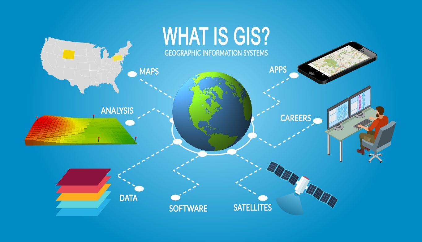
Ever pondered how those super-detailed maps on your phone magically know exactly where you are, or how city planners get a bird’s-eye view of urban sprawl? The secret often lies within Geographic Information Systems (GIS), those clever tools that let us see and analyze the world through location-based data. But what *is* this “spatial data” everyone talks about, and what are its main flavors? Don’t worry, fellow explorer of the digital realm, because we’re about to uncover the three main types of GIS spatial data that help us make sense of our planet. Think of it as unwrapping a digital present, with each layer revealing something important about the world around us.
Simply put, spatial data is information that tells us where things are on Earth. It could be the spot where your favorite bookstore sits or the outline of an entire country. To handle all this varied information effectively, GIS organizes it into three key categories. Knowing these categories is super helpful whether you’re a GIS whiz or just curious about the tech that’s shaping our lives. So, grab a virtual seat, because we’re about to dive into the interesting world of vectors, rasters, and tables — the dynamic trio that helps us understand spatial information.
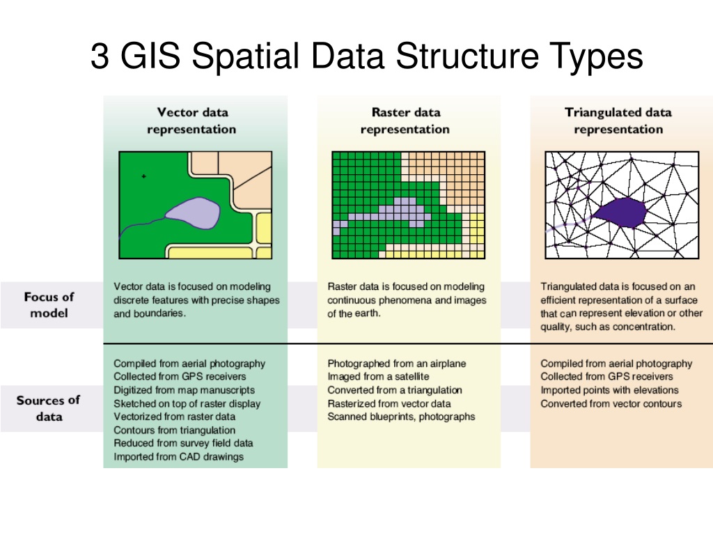
Imagine trying to describe your go-to coffee shop to someone. You might mention the street it’s on (a line), the building itself (a polygon), and maybe even the exact spot where you usually sit (a point). These everyday descriptions actually mirror one of the main types of GIS data: vector data. Vector data uses simple geometric shapes — points, lines, and polygons — to represent real-world features. Think of it as drawing on a digital map with these basic shapes. Each shape is defined by its coordinates, allowing for precise location and form.
Points are like single dots on the map, representing individual locations such as a specific landmark or an accident site. Lines, or polylines, are a series of connected points, perfect for showing things like roads, rivers, or utility lines. Polygons are enclosed areas formed by connected lines, ideal for representing lakes, parks, or administrative regions. What’s really neat about vector data is its ability to store how these features are connected or next to each other — that’s called topology, and it’s super useful for many kinds of spatial analysis. Plus, vector data is generally quite efficient for storing distinct features and often creates sharp, clear maps. It’s like having a perfectly outlined digital sketch of the world.
The World in Pixels: Getting to Know Raster Data
Understanding How Continuous Information is Represented by Grids
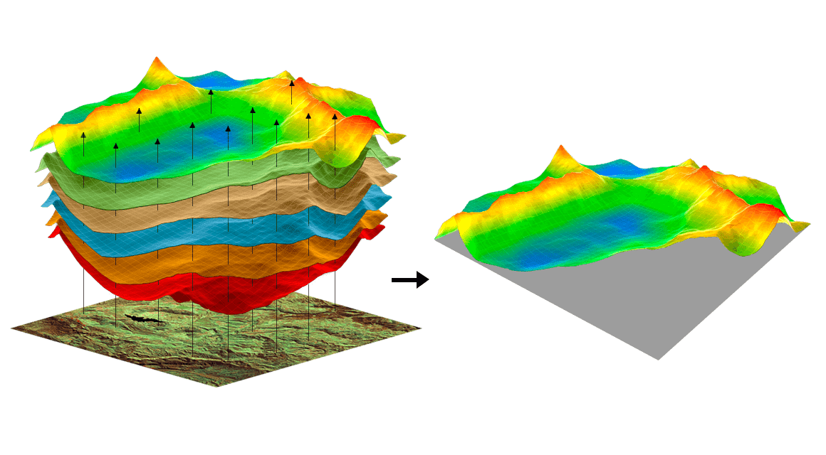
Now, let’s shift gears from distinct objects to continuous surfaces. Picture looking at a satellite image or a photo taken from an airplane. What you see is a grid of tiny squares, and each square has a specific value representing something about the Earth’s surface. This, in essence, is raster data. Unlike vector data, which focuses on distinct features, raster data shows the world as a continuous surface broken down into a grid of cells, or pixels. Each pixel holds a value that corresponds to a particular attribute at that location, like elevation, temperature, the type of land cover, or even how much light it reflects.
Think of a digital photo; it’s made up of countless tiny pixels, each with a specific color. Raster data in GIS works similarly, but instead of colors, the pixel values represent geographic information. For example, in an elevation raster, each pixel’s value might tell you the height above sea level at that exact spot. Similarly, a land cover raster might have pixel values indicating forest, water, or urban areas. The resolution of a raster dataset, which depends on the size of its pixels, determines how much detail it can capture. Smaller pixels mean more detail but also larger file sizes.
Raster data is particularly good at representing things that change smoothly across space. Think about temperature changes, rainfall amounts, or different types of soil — these are all great examples of what raster data can show us. Also, raster data is often the natural format for images taken from space or airplanes, making it incredibly useful for things like tracking environmental changes, managing resources, and lots of other applications. While it might not be the most efficient way to store distinct objects compared to vector data, its ability to represent continuous surfaces gives us a really important perspective on our planet.
So, while vector data gives us the precise outlines of things, raster data paints a picture of the gradual changes across the landscape. Both are really important tools in the GIS toolbox, offering different but complementary ways of showing us the spatial world. It’s like having both a detailed line drawing and a beautiful watercolor painting of the same scene — each one highlights different aspects of reality.
Beyond the Shapes: The Power of Information Tables in GIS
Connecting Details to Locations for a Deeper Understanding
We’ve talked about the shapes and grids that represent our world in GIS. But what about the extra information that goes along with these locations and features? That’s where tabular data comes in, often working behind the scenes to add a lot of value to GIS. Tabular data is basically information organized in rows and columns, kind of like a spreadsheet or a database. In GIS, this data is used to store characteristics or attributes that are linked to the spatial features we see in vector or raster data.
Let’s go back to our vector representation of a park. While the polygon shows us its boundaries, tabular data can give us all sorts of details about it, like its name, how big it is, how many benches it has, what kinds of trees grow there, or even when it’s scheduled for maintenance. This extra information is usually linked to the spatial features using a unique identifier. For vector data, each point, line, or polygon can have a corresponding row in a table, with each column representing a different attribute. Similarly, for raster data, tables can store general information about the entire dataset or be linked to specific pixel values or groups of pixels.
The real magic of tabular data in GIS is that it allows us to analyze and visualize things based on these attributes. For example, you could use this data to select all the parks that are larger than a certain size, to color-code roads based on how much traffic they have, or to calculate the average income in different neighborhoods (represented as polygons). Without this extra attribute information, our spatial features would just be shapes on a map, missing the rich context we need for meaningful analysis and decision-making. It’s like having a map with just the outlines of cities, but no information about how many people live there, what kind of businesses they have, or what their cultures are like.
So, tabular data acts as the crucial link between the “where” and the “what” in GIS. It makes our spatial understanding richer by providing the descriptive details that bring maps and spatial analyses to life. Whether it’s the number of people living in a certain area, the type of tree at a specific location, or the kind of soil in a particular part of a raster image, tabular data adds that essential layer of information that turns simple spatial data into powerful insights.
Putting It All Together: How the Three Data Types Play as a Team
Working Together for a Complete Picture of Our Spatial World
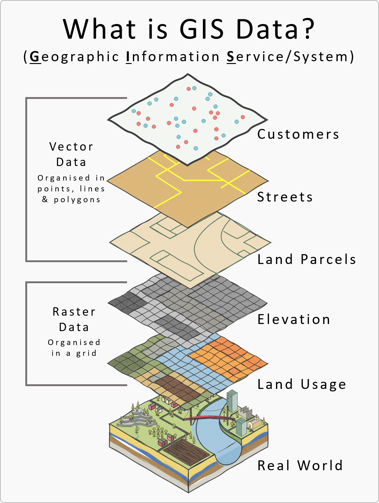
While we’ve talked about vector, raster, and tabular data as separate categories, the real power of GIS comes when these different types of data work together smoothly. In many real-world situations, these three fundamental types of spatial data are combined to give us a complete understanding of what’s happening geographically. Think about planning a new housing development. You might have vector data showing existing buildings, roads, and property lines, layered on top of a raster image that shows the different types of land cover. At the same time, tabular data linked to the buildings could contain information about how many people live there, how old they are, and their property values.
This combination allows for complex analyses that wouldn’t be possible with just one type of data. For instance, you could analyze how a new road (vector) might affect different types of vegetation (raster) and then use the tabular data to find out how many houses (vector with attributes) are within a certain distance of the proposed road. This teamwork between the three data types is what makes GIS such a useful and versatile tool in many different fields, from studying the environment and planning cities to managing public health and responding to disasters.
The ability to combine and analyze different data types allows GIS professionals to answer complex spatial questions and make informed decisions. Imagine using satellite images (raster) to identify areas where forests are being cut down, then overlaying vector data of protected areas to see how much of that deforestation is happening within those boundaries, and finally using tabular data on animal populations to understand the potential impact on wildlife. This interconnectedness is a key part of advanced GIS analysis and shows why it’s so important to understand what each data type can do and what its limitations are.
Ultimately, using GIS effectively means knowing how to strategically combine vector, raster, and tabular data. Each type brings its own strengths, and when they work together, they allow us to go beyond just seeing spatial information to truly understanding the complex relationships and patterns that shape our world. It’s like having a team of experts, each with their own special skills, working together to solve a complicated problem — the combined knowledge gives us much better insights than any single expert could achieve alone.
Got Questions? We’ve Got (Hopefully) Good Answers!
Your Common GIS Data Queries Addressed
Okay, we get it, you probably have some questions swirling around in that smart mind of yours. Don’t worry, curious reader, we’ve thought about some of the most common questions people have about the fascinating world of GIS spatial data. Let’s jump in and satisfy that curiosity!
Q: If I have a list of addresses, what kind of GIS data is that?
A: Great question! A list of addresses by itself is basically tabular data. However, to make it spatially useful in GIS, you’d usually perform something called geocoding. This process converts those addresses into geographic coordinates (latitude and longitude). Once geocoded, each address would be represented as a point on a map, making it vector data with associated information (the address itself, and maybe other details about that location). It’s like giving each address its own digital spot on the map!
Q: Sometimes raster data looks a bit pixelated. Is that something to be concerned about?
A: That’s a sharp observation! Yes, the “blockiness” you see is a direct result of raster data being made up of individual pixels. The size of these pixels determines the resolution — smaller pixels mean more detail but also larger file sizes. For some uses, a less detailed resolution is perfectly fine, while others need very high-resolution images. It’s all about finding the right balance for what you’re trying to do. Think of it like zooming in on a digital picture; eventually, you start to see the individual squares.
Q: Is it possible to switch between these different types of data?
A: Absolutely! GIS software is quite good at handling data conversions. You can often turn vector data (like polygons showing property boundaries) into raster data (a grid showing land ownership). Similarly, you can sometimes extract vector features from raster data (like drawing roads on a satellite image). However, it’s important to know that these conversions can sometimes lead to a loss of detail or require careful consideration of the best methods and settings. It’s not always a perfect translation, kind of like trying to describe a complicated piece of music with just a few simple words.
Hopefully, these answers have given you a better understanding of the interesting world of GIS spatial data. Remember, knowing these three main types — vector, raster, and tabular — is key to really using the power of geographic information systems and gaining deeper insights into our world and how everything is connected spatially. Now, go out there and explore the digital layers of our planet with your new knowledge!

Spatial Analysis Of Geospatial Data Processing And Use Cases

Ppt Gis Data Structures Powerpoint Presentation, Free Download Id

Why Geospatial Data Is Important Slingshot Simulations

Gis Data Types Spatial (raster And Vector) Attribute Data, Youtube

